Instagram Stories Highlights is a feature that allows users to save and organize their stories beyond the typical 24-hour lifespan on their profiles. This section has quickly become one of the most crucial elements of an Instagram profile, enabling brands and individuals to showcase important and evergreen content. However, what is often overlooked is the vital role of Highlight Covers in this context.
Highlight Covers are the first thing a user sees when visiting your profile and play a key role in creating a strong “First Impression.” These covers not only help organize your content but also serve as powerful visual tools to enhance brand identity and attract your audience. In this article of Insget mag, we will delve into the profound importance of Highlight Covers, why they matter for your brand, and how to create cohesive and engaging covers.
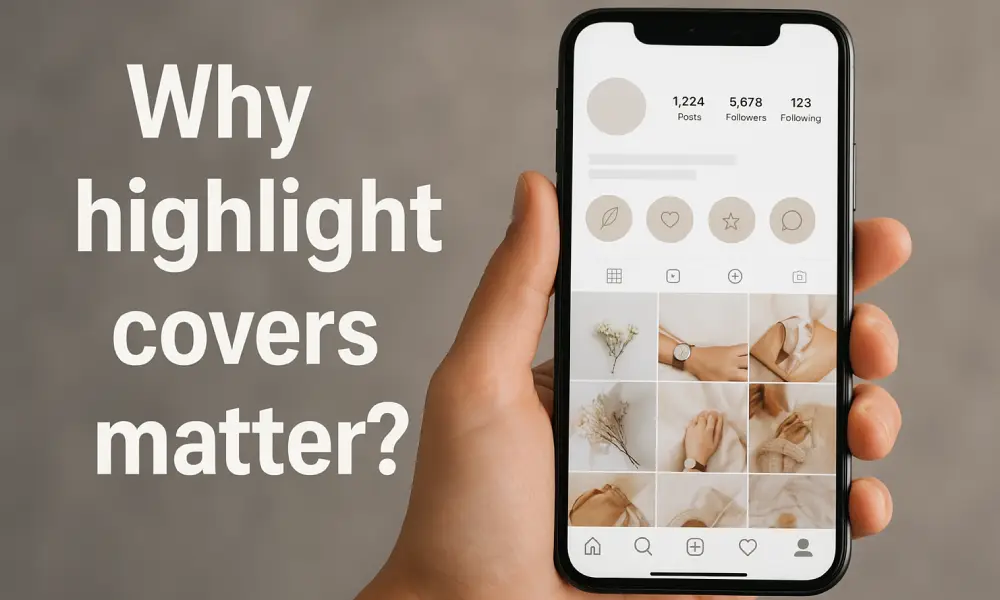
More Than Just Pretty Pictures: What Are Instagram Highlight Covers?

Instagram Highlight Covers are essentially small images that serve as the visual facade for your curated collection of highlighted stories. These covers allow users to quickly identify and access the content within each highlight. Unlike regular stories that disappear after 24 hours, highlights remain permanently on your profile, making their covers crucial for the aesthetic and functionality of your profile.
What Exactly Are Highlight Covers?
Highlight Covers are the visual representation of the content within each highlight. They can include icons, images, or short text that clearly indicate the highlight’s theme. Their primary purpose, beyond visual appeal, is to guide the user and improve navigation within your profile. A good highlight cover is not only attractive but also helps the audience understand the content without needing to click on each highlight.
The Psychology Behind a Well Organized Profile
Your Instagram profile is the storefront of your business or personal brand. Just as a physical store with an attractive and organized display draws in more customers, an Instagram profile with well-arranged highlights and engaging covers can have a similar effect. Visual psychology indicates that humans process visual information 60,000 times faster than text .
This means that a visually organized and appealing profile can instantly spark trust and curiosity in the audience. Highlight Covers play a vital role in this; they help create a sense of cohesion and professionalism, which in turn leads to a stronger “first impression” and attracts more followers.
5 Powerful Reasons Why Highlight Covers Matter for Your Brand
Highlight Covers are more than just an aesthetic element; they are strategic tools that can significantly impact your brand’s perception, audience engagement, and ultimately, your business success on Instagram. Here are 5 key reasons why they matter:

1. They Create a Powerful First Impression & Instant Brand Recognition
As mentioned earlier, Highlight Covers are the first thing visitors see on your profile. A professional and attractive design can create a positive and lasting first impression in under 3 seconds .
This initial impact is crucial in determining whether a user decides to explore your profile further or leave. Furthermore, using consistent visual elements (such as specific colors, fonts, and icons) in your Highlight Covers helps with instant brand recognition.
This visual consistency allows audiences to identify and remember your brand even before reading its name. This is especially important in the competitive Instagram environment, where over 200 million business profiles are active daily.
2. They Communicate Professionalism and Attention to Detail
Brands that pay attention to small details like Highlight Cover design convey a sense of professionalism and credibility to their audience. This shows that you value every aspect of your online presence and prioritize quality.
81% of customers need to trust a brand before buying from them, and 86% of consumers believe that authenticity is important to support a brand . High-quality and cohesive Highlight Covers contribute to building this trust and authenticity, demonstrating that you are a reliable and reputable brand.
3. They Enhance User Experience and Navigation
Highlight Covers act as a visual navigation system, helping users quickly and easily find the content they are looking for. Instead of users having to browse through all your highlights to find specific information, clear and distinct covers allow them to directly access sections of interest (such as products, services, FAQs, customer testimonials, etc.).
This improvement in user experience (UX) not only encourages users to spend more time on your profile but also increases their likelihood of engagement and conversion. Profiles that offer a better user experience tend to have higher retention rates.
4. They Reinforce Your Brand Identity (Colors, Fonts, Aesthetics)
Highlight Covers provide an excellent opportunity to reinforce your brand’s visual identity. By using your brand’s primary colors, specific fonts, and unique design style, you can create visual consistency across your entire profile.
This visual cohesion helps audiences easily remember your brand and differentiate it from competitors. Research shows that consistent brand presentation across all platforms can increase revenue by up to 23%. Colors also play a significant role in visual psychology; for example, blue is often associated with calmness and trust, while red conveys excitement. Thoughtful selection of colors and fonts in Highlight Covers can effectively communicate your brand’s message.
5. They Drive Engagement and Conversions
By improving user experience and reinforcing brand identity, Highlight Covers indirectly contribute to increased engagement and conversion rates. When users can easily find the content they want and enjoy the visual appeal of your profile, they are more likely to interact with your content (such as watching full stories, sending messages, or clicking on links). User-generated content (UGC) in highlights can build trust among followers and increase your business’s credibility.
Additionally, by directing users to specific highlights (such as product highlights or customer reviews), you can guide them towards desired actions (such as purchasing, signing up, or contacting). Instagram is recognized as a powerful shopping platform, with an estimated 46.8 million people in the U.S. expected to make purchases directly through Instagram in 2025.
How to Create Cohesive & On-Brand Highlight Covers: A Step-by-Step Guide

Creating Instagram Highlight Covers that are both appealing and aligned with your brand identity requires a strategic approach. Here’s a step-by-step guide to help you:
1.Define Your Visual Style Guide (Colors & Fonts)
Before you start designing, you should have a clear visual style guide for your brand. This includes your brand’s primary color palette, fonts, and overall design aesthetic. Using your brand colors in Highlight Covers helps reinforce brand recognition.
For example, if your brand uses blue and white, your Highlight Covers should reflect these colors. Font selection is also important; choose a font that is legible and aligns with your brand’s personality. This step will form the foundation for visual consistency across all your highlights.
2.Choose Icons or Imagery That Reflect Your Niche
The icons or images used in your Highlight Covers should clearly represent the content of the highlight and be relevant to your niche. For instance, a restaurant might use icons of food, drinks, or cutlery, while a fashion designer might use icons of clothing, a sewing machine, or scissors.
You can opt for simple, minimalist icons for a clean and professional look, or use high-quality, real-life images to attract more attention. The key is that the icons or images should be easily recognizable and convey the right message.
3.Use the Right Tools (Canva, Adobe Spark, Illustrator)
Several tools are available for designing Highlight Covers, each offering different capabilities and levels of complexity:
- Canva: A user-friendly online tool that provides ready-made templates and a variety of design elements. Canva is an excellent option for individuals without extensive design experience.
- Adobe Spark: A tool similar to Canva from Adobe, offering simple and quick graphic design features.
- Adobe Illustrator: For professional designers who seek complete control over design details and custom icon creation, Illustrator is the best choice.
Choosing the right tool depends on your skill level and the complexity of your desired design.
4.Size and Format Correctly (The Perfect Dimensions)
Adhering to the correct dimensions and format for Highlight Covers is crucial to prevent cropping or low-quality appearance. The recommended dimensions for Highlight Covers are 1080×1080 pixels (1:1 aspect ratio).
Instagram automatically crops the image into a circle, so ensure that your main design elements are centered to be clearly visible after cropping. The file format should be JPG or PNG to maintain image quality.
Real-World Examples: Brands Nailing Their Highlight Covers

Examining successful brands can provide great inspiration for designing your Highlight Covers. Here are a few examples of brands that have effectively utilized this feature:
Nike:
Nike has created a highly organized and user-friendly profile by using simple, minimalist icons that clearly represent different product categories (e.g., running, basketball, football). The colors used in their covers perfectly align with Nike’s brand identity, conveying a sense of power and movement.
Glossier:
This beauty brand, focusing on natural beauty and simplicity, uses Highlight Covers with a soft color palette and delicate icons. Their highlights include makeup tutorials, customer reviews, and new products, all presented with visually appealing and cohesive covers. This approach helps reinforce the brand’s sense of community and authenticity.
A Successful Local Brand (e.g., a Cafe):
Many successful local cafes and restaurants use Highlight Covers to showcase their menu, events, cafe ambiance, and customer testimonials. They often use real, high-quality images of coffee, food, or the cafe interior as covers, which convey a warm and inviting feeling to the audience. This approach helps customers familiarize themselves with the cafe’s atmosphere before visiting.
These examples demonstrate how different brands, considering their identity and audience, strategically use Highlight Covers to enhance user experience and strengthen their branding.
Common Mistakes to Avoid With Your Highlight Covers

While Highlight Covers are powerful tools, there are common mistakes that can diminish their impact. Being aware of these pitfalls will help you avoid them and achieve the best results:
Inconsistency:
One of the biggest mistakes is a lack of consistency in cover design. Using different styles, unrelated colors, or varied fonts across different covers can confuse your audience and make your brand appear unprofessional. Visual consistency is crucial for reinforcing brand identity.
Low-Quality Images:
Using pixelated, blurry, or low-resolution images as covers significantly detracts from your profile’s appeal. Always use high-quality, clear images that accurately represent the highlight’s content.
Using Inappropriate or Illegible Fonts:
Choosing a font that is difficult to read or doesn’t align with your brand’s style can disrupt the user experience. Opt for simple, clear fonts that are consistent with your brand’s visual identity.
Overly Cluttered Designs:
Highlight Covers are small and have limited space. Overloading them with too many elements, lengthy text, or multiple icons can make them appear cluttered and confusing. Simple and minimalist designs are usually more effective and convey the message clearly.
Mismatch Between Cover and Content:
The cover should clearly indicate the highlight’s content. If the cover doesn’t match the content within the highlight, users will be misled and may become frustrated with your profile.
Ignoring Correct Dimensions:
Failing to adhere to the 1080×1080 pixel dimensions and neglecting the central safe area for circular cropping can result in important parts of your design being cut off.
By avoiding these common mistakes, you can ensure that your Highlight Covers effectively contribute to your branding and audience engagement.

Conclusion: Elevate Your Instagram Branding Today
Create Custom Highlight Covers on Instagram are more than just an aesthetic element; they are powerful and strategic tools for strengthening branding, improving user experience, and increasing engagement on Instagram. They help you create a lasting first impression, showcase your professionalism, simplify navigation for users, reinforce your brand identity, and ultimately, contribute to increasing your conversion rates.
By following design tips, avoiding common mistakes, and drawing inspiration from successful brands, you can create Highlight Covers that are not only visually appealing but also effectively contribute to your marketing goals on Instagram. Remember that every detail on your profile, including Highlight Covers, is an opportunity to connect with your audience and build a strong brand.
Ready to design your own stunning highlight covers? Explore our custom template pack designed for brands like yours!